
Rising bottoms
In the financial market world a great many people pay attention to a breed of analyst known as a “chartist”. As the name suggests, this analyst believes that chart formations are predictive of future movements. Clearly a fundamental analyst might regard this type of study as absolute tosh, but a surprising number of people pay a great deal of attention to it. Chartists can command princely fees.
The basis of chartism is that conclusions can be drawn from historic trend lines and support lines, on the price movement chart of an asset or index. An absolutely glorious array of patterns can be discerned by the experienced analyst, from “rising wedges”, to “head and shoulders”, to “descending triangles”, and an awful lot more in between.
After a correction and long consolidation, many chartists look for a series of “rising bottoms”. This is the definition of a “rising bottom”:
“A pattern on a security’s chart that results from the daily low price rising over time, creating a series of ascending troughs. Technical traders use this pattern to confirm that the trend of the underlying security is heading upward.”
Well well well, what have we here?
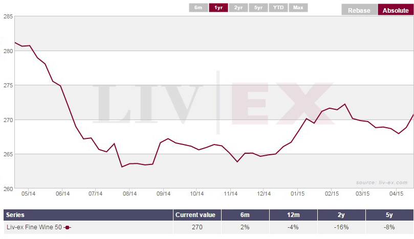
This is the Liv-ex 50 going back a year. We have been arguing for a few months now that we believe the base formed last summer was likely to be a long term low. We saw that low approached, but not challenged, in November. After the Chinese New Year period we saw a further mini-correction which in turn left the November low unchallenged. This leaves us with a series of rising lows, or the pattern known as a “rising bottom”.
Investopedia suggests: “This pattern is considered to be bullish. Rising bottoms signify increasing basic support levels and ascending tops.”
A technical analyst would also point out that the Liv-ex 50 has “previous” around these levels. As you can see from the 15 year chart, between the summer of 2007, and the summer of 2008, the market had a good consolidation around the 270 mark, before correcting back to around 210 then launching itself into orbit. What this means, from a chart perspective, is that we should not be too surprised that the base established last summer was at this precise level, because the activity back in 2007 and 2008 has created a significant support level.
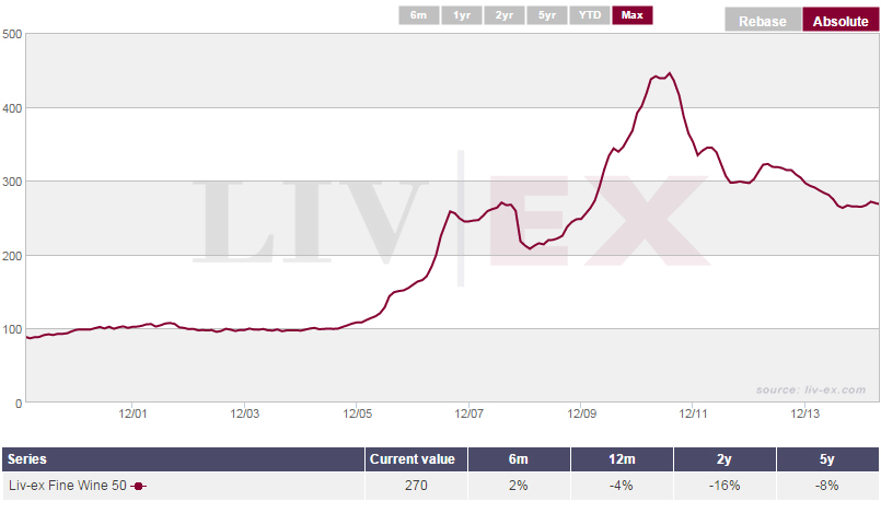
Chart analysis is the Marmite of the investment world, but since there are so many ways to skin the investment cat, we see it as our job to make sure our clients have as many tools as possible with which to fashion their investment decisions.
I have little doubt that when we look back down on the 270 level in the months to come, some sage old wags will be heard to say: “See, it was all there in the charts.”